The power of information hierarchy in web design & UX

Ever wondered why some websites just click with users while others seem to leave them scratching their heads? Well, it all comes down to something called information hierarchy – and it’s about time we shed some light on this.

Information Hierarchy in UX

When someone quickly looks at your website, they decide if they like it in just 50 milliseconds. That’s really fast, right? This quick judgment shows how important it is to organize your website well. It’s like a map that helps people find what they need easily. But why is this organization so important for making the website user-friendly (UX)? Let’s find out.
What is Information Hierarchy?

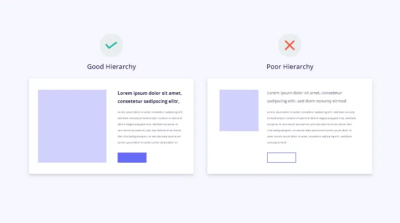
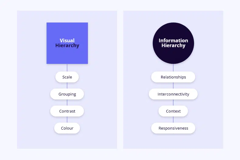
Information hierarchy refers to the way content is organized and presented on a website or other digital platform.

It involves structuring information in a way that makes it easy for users to understand and navigate. This includes prioritizing important content, grouping related information together, and providing clear pathways for users to access the information they need. In simpler terms, it’s like arranging things on a shelf so that the most important items are easy to find, making the overall experience more user-friendly.

Why Information Hierarchy Matters

Well, think of it like organizing a messy room. When everything is scattered around, it’s chaotic and confusing, right? The same goes for websites without a clear information hierarchy. Visitors can feel lost and frustrated, leading them to click away faster than you can say “back button.” But with a well-structured hierarchy, you create a smooth, enjoyable browsing experience that keeps people coming back for more.

The Building Blocks & Principles of Information Hierarchy

Similar to other customer-centered strategies, UX hierarchy follows specific principles to ensure your website is both user-friendly and impactful.
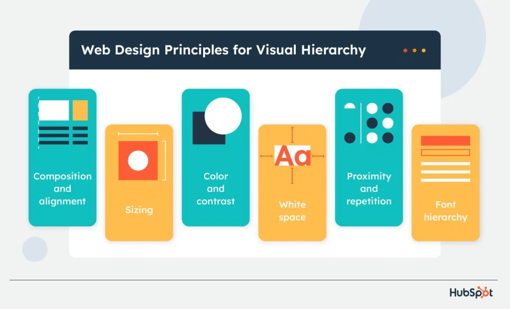
  • Visual Elements: Colors, fonts, and images catch attention and set the mood of your website. Choosing the right mix creates an inviting space that keeps visitors interested. Clear visual cues also help users understand what’s important on your site.
  • Textual Elements: Clear headings and well-structured paragraphs break down information into manageable chunks, making it easier for users to scan and understand. This improves readability and comprehension, allowing visitors to quickly find what they’re looking for without getting overwhelmed.
  • Interactive Elements: Buttons and links provide intuitive navigation options, allowing users to move seamlessly between pages and access desired content with just a click. Placing these elements strategically ensures smooth navigation and enhances user experience & usability.
  • Layout and Structure: Sitemaps and menus serve as roadmaps that guide users through your website’s architecture. By presenting a clear overview of the site’s structure and navigation options, they help users orient themselves and understand how different pages are interconnected. This again promotes efficient navigation and improves usability by ensuring that users can easily locate and access the content they need.
© Image Credit: https://blog.hubspot.com/marketing/visual-hierarchy

How We Make Information Hierarchy Work for You

In our website design process, we begin by understanding your priorities. We discuss what matters most to your business, whether it’s showcasing your latest products, making your contact information easily accessible, or highlighting other key aspects. Once we have a clear understanding of your goals, we strategically arrange your content to ensure that the most important elements are prominently featured. This means placing essential information front and center, where it’s immediately visible to visitors. 

Meanwhile, less critical content is organized in a way that doesn’t distract from the main focus. We use clear headings and labels to guide users through your site, making it easy for them to navigate and find what they’re looking for. Additionally, we ensure that there’s plenty of space between elements to prevent clutter and allow your content to breathe, creating a visually pleasing and user-friendly experience. Certainly, achieving these goals requires time, research, analysis, and collaboration, but we always keep you informed every step of the way, seeking your feedback to ensure we’re on the right track.

Wrapping Up

Investing in UX hierarchy means making your website easy and enjoyable for people to use.

You want everything to be in the right place so visitors can have a great time without getting lost or confused. By arranging things like the sitemap (which shows all the pages on your site), content (like articles or product descriptions), and information (like contact details) in a clear and logical way, you make it simple for users to find what they’re looking for. This not only makes them happier but also keeps them coming back for more.

Remember, UX optimisation is all about putting users first and making sure their experience on your website is smooth and stress-free. And when users have a great experience, it’s good for business too!

UX Information Hierarchy FAQs

1. What exactly is information hierarchy?

Information hierarchy is all about organizing the content on your website in a way that makes it easy for users to navigate and understand. It involves prioritizing important information, guiding users through the content, and creating a structure that enhances the overall user experience. Find out more about our content strategy here: What’s a content strategy & why you need one.

2. How does sitemap hierarchy contribute to UX?

Sitemap hierarchy acts as a roadmap for your website, showing all the pages and how they’re connected. By organizing the site’s structure effectively, it ensures that visitors can easily navigate through the site and find the information they need quickly, improving their overall experience. For more digital marketing tips, click here: Boost conversions with these UX tips.

3. What is the importance of content hierarchy?

Content hierarchy prioritizes important information, making it more accessible and reducing cognitive load for users. By structuring content in a logical and intuitive way, businesses can ensure that users can easily scan and digest the information presented, enhancing usability.

4. How does information hierarchy benefit users?

Information hierarchy guides users through the website’s content, ensuring that they can easily understand and digest the information presented. By organizing content effectively, businesses can create a seamless browsing experience that keeps users engaged and satisfied.

5. Why is investing in UX hierarchy important for businesses?

Prioritizing UX hierarchy aligns with UX principles, including user-centered design, which focuses on designing products and services based on users’ needs and preferences. By investing in UX hierarchy, businesses can create a more intuitive and enjoyable browsing experience, increasing customer satisfaction and driving business success.